2.4.Displaying & Describing Data

Plots and Tables

Bárbara D. Bitarello

2025-09-24

Outline

  • CV example
  • Manipulating means and variance (example: converting units)
  • Why plot? Aren’t numerical summaries enough?
  • Letting data type guide visualizations

CV example

Recall the bee lifespan example. We found that \(\bar{Y}=27.848\) hours and \(s=20.555\) hours.

\(CV = 100\% \times \frac{s}{\bar{Y}}\)

\(CV = 100 \% \times \frac{20.555}{27.848}=100 \times 0.738 = 73.813\)

Good estimators are unbiased

  • The expected value of an unbiased estimator equals the population parameter.

  • Biased estimators should be avoided if possible.

  • Biased estimators (often) change with the sample size.

  • The sample variance and sample standard deviation are divided by (n – 1), rather than n to minimize bias.

  • The range is a bad summary statistic because it is biased, and increases with sample size.

Measures of width in graphical terms

SD and var: Particularly informative for symmetric distributions, but not for asymmetric ones

Manipulating means

  • The mean of the sum of two variables \(X\) and \(Y\): \(E[X + Y] = E[X]+ E[Y]\)

  • The mean of the sum of a variable \(X\) and a constant \(c\): \(E[X + c] = E[X]+ c\)

  • The mean of a product of a variable \(X\) and a constant \(c\): \(E[cX] = cE[X]\)

Manipulating variance

  • The variance of the sum of two variables \(X\) and \(Y\): \(Var[X + Y] = Var[X]+ Var[Y]\) (if and only if X and Y are independent).

  • The variance of the sum of a variable \(X\) and a constant \(c\): \(Var[X + c] = Var[X]\)

  • The variance of a product of a variable \(X\) and a constant \(c\): \(Var[cX] = c^2 Var[X]\)

Example: converting units

If the mean and variance in height (in centimers) in a sample are \(\bar{X}=169.8\text{ cm}\) and \(s^2=131.98\text{ cm}^2\) and \(1\text{ cm} = 0.394\) inches, find the mean and variance in inches.

Mean: \(E[cX] = cE[X]\)

\(0.394\times169.8\text{ cm}=66.90\text{ inches}\)

Variance: \(Var[cX] = c^2 Var[X]\)

\(0.394^2\times131.98\text{ cm}^2 = 20.488\text{ inches}^2\)

Lastly: Rounding

  • Computers can return values with precision that exceeds biological interest.
  • When sharing results, round numbers to a reasonable number of significant figures.
  • Presenting one or two more digits than initially measured is a good rule of thumb.
  • DO NOT round while calculating or sharing intermediate results!
  • Round only the final results of the specific summaries of interest.

How about plots?

Aren’t numerical summaries enough?

No!

Case Study: Anscombe’s Quartet

Four data sets (A-D) with identical summaries (mean and sd)

Code
library(datasets)
head(anscombe)
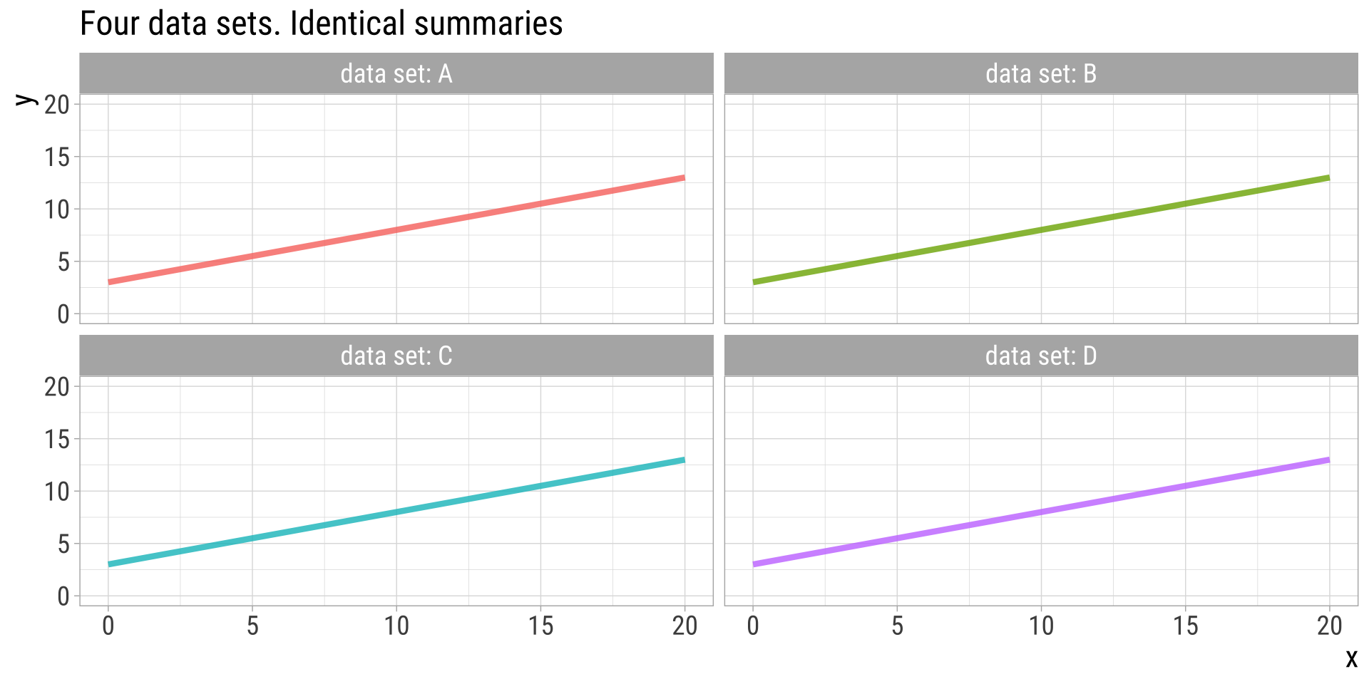
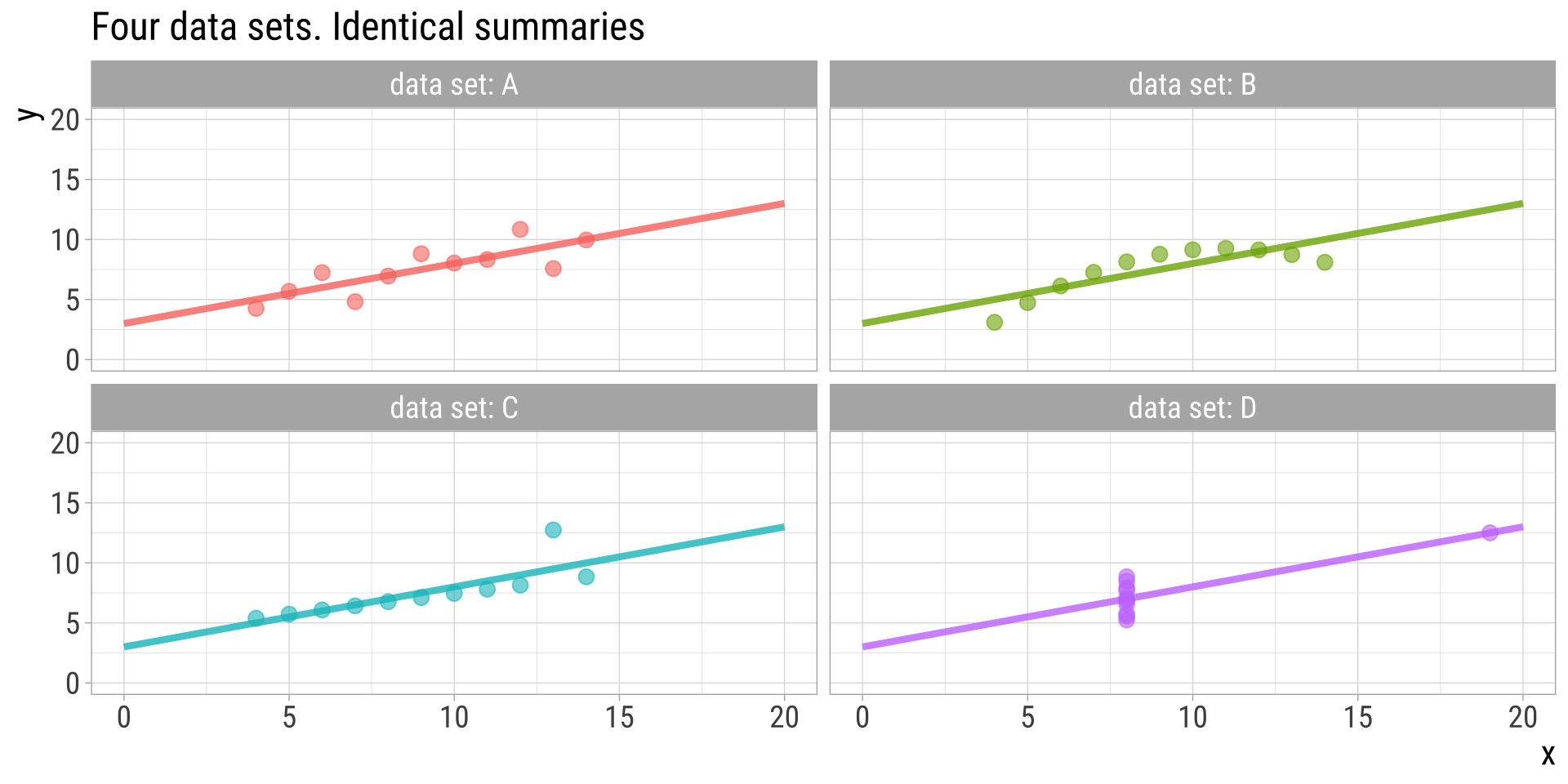
  x1 x2 x3 x4   y1   y2    y3   y4
1 10 10 10  8 8.04 9.14  7.46 6.58
2  8  8  8  8 6.95 8.14  6.77 5.76
3 13 13 13  8 7.58 8.74 12.74 7.71
4  9  9  9  8 8.81 8.77  7.11 8.84
5 11 11 11  8 8.33 9.26  7.81 8.47
6 14 14 14  8 9.96 8.10  8.84 7.04
Code
str(anscombe)
'data.frame':   11 obs. of  8 variables:
 $ x1: num  10 8 13 9 11 14 6 4 12 7 ...
 $ x2: num  10 8 13 9 11 14 6 4 12 7 ...
 $ x3: num  10 8 13 9 11 14 6 4 12 7 ...
 $ x4: num  8 8 8 8 8 8 8 19 8 8 ...
 $ y1: num  8.04 6.95 7.58 8.81 8.33 ...
 $ y2: num  9.14 8.14 8.74 8.77 9.26 8.1 6.13 3.1 9.13 7.26 ...
 $ y3: num  7.46 6.77 12.74 7.11 7.81 ...
 $ y4: num  6.58 5.76 7.71 8.84 8.47 7.04 5.25 12.5 5.56 7.91 ...

Anscombe’s quartet: summary statistics

group mean.x mean.y sd.x sd.y cor.xy
A 9 7.500909 3.316625 2.031568 0.8164205
B 9 7.500909 3.316625 2.031657 0.8162365
C 9 7.500000 3.316625 2.030424 0.8162867
D 9 7.500909 3.316625 2.030579 0.8165214

Anscombe’s quartet: trendlines

Trendlines reveal no difference

Anscombe’s Quartet: Data

Showing the data reveals large differences

Ascombe described the article as being intended to counter the impression among statisticians that “numerical calculations are exact, but graphs are rough.”

Displaying data is very important

Displaying data helps you:

  1. Understand your data
  2. Communicate your results

Exploratory vs Explanatory Plots: Goals

In exploratory data analysis, you aim to find the story of the data.

In explanatory data analysis, you aim to share the story of the data.

Exploratory vs Explanatory Plots: Focus

For exploratory plots: Don’t fuss about colors, labels, names etc. The goal is for you to understand the data.

For explanatory plots: Fuss about all of this. You must consider your audience may, for example, consist of:
- People unfamiliar with your data
- People who are colorblind

Which types of summaries and graphs to use?

Let data type guide presentation

To visualize data for a single variable…

Show its frequency distribution

One categorical variable

Barplot/bar graph

  • What is the variable?
  • Notice the ordering
  • Absolute or relative frequencies?
  • Bar area reflects frequencies

One categorical variable

Pie chart

  • Same purpose as bar graph
  • Much harder to spot patterns
  • Bar graphs generally preferred

One categorical variable

Frequency table

Cause_of_death Number
Accidents 6688
Homicide 2093
Suicide 1615
Malig. tumor 745
Heart disease 463
Congen. abnor. 222
Chronic res. disease 107
Flu/pneumonia 73
Cerebrov. disease 67
Other tumor 52
All other cause 1653

One numerical variable

Goals

  • Visualize the center (“average”)
  • Visualize the spread (variability)
  • Visualize the shape (distribution)

One numerical variable

Histogram

Code
datasets::airquality |>
  ggplot(aes(x = Temp)) +
  geom_histogram() +
  xlab("Temp (in Fahrenheit)") +
  ggtitle("Maximum Daily Temperature") +
  bb_theme() # this is just a theme I made to make plots look better

30 bins

Histograms – consider your bins

  • Each block of a histogram is called a “bin”
  • The size or “width” of a bin refers to the range in each block.
  • Changing bins can change stories
  • Don’t be fooled.
  • Don’t allow bad bin widths to obscure your data.

DO NOT assume that default bin widths are appropriate.

One numerical variable

Density Plots

One numerical variable

Frequency table

Measured in LaGuardia Airport, NY, 1973. Data from the “airquality” dataset from the datasets package.

  • 11 bins

  • equally-sized

Next week

  • More on the types of plots/tables for different types of data
  • Principles of good plots

That’s all for today!

Forrest says "And that's all I wanted to say about that"

From: makeameme.org