2.6.Displaying & Describing Data
Plots and Tables
2025-10-01
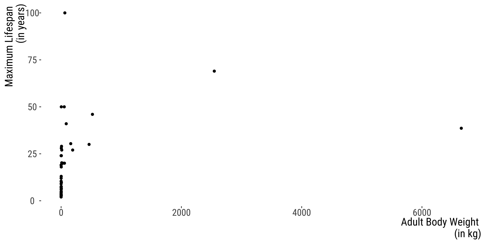
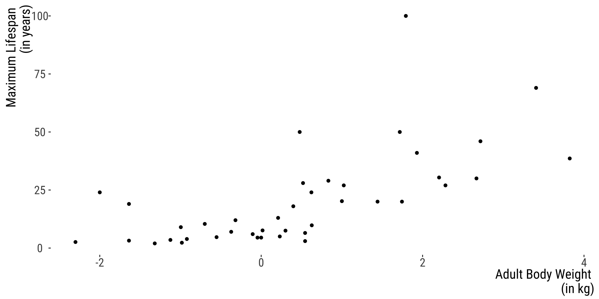
Transform Data to Reveal Patterns 👍
Problem?
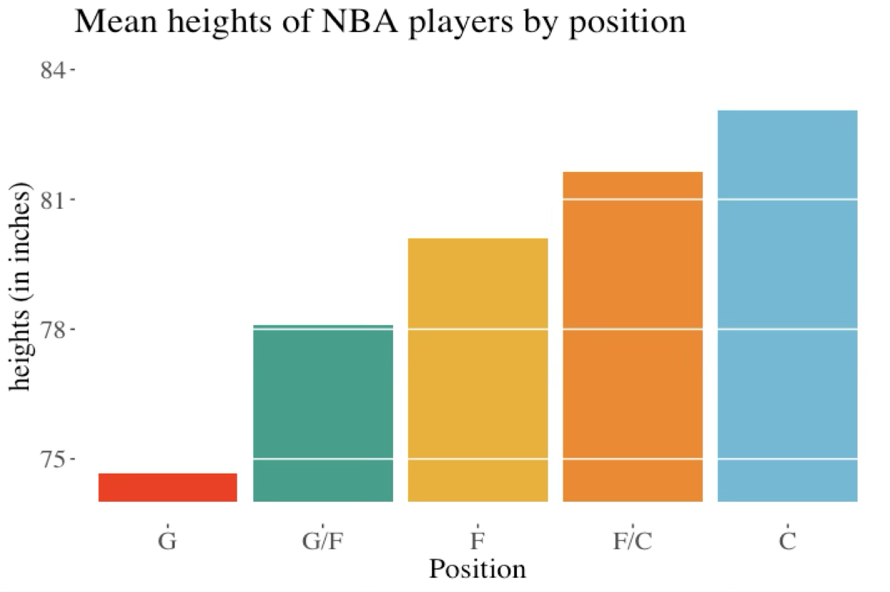
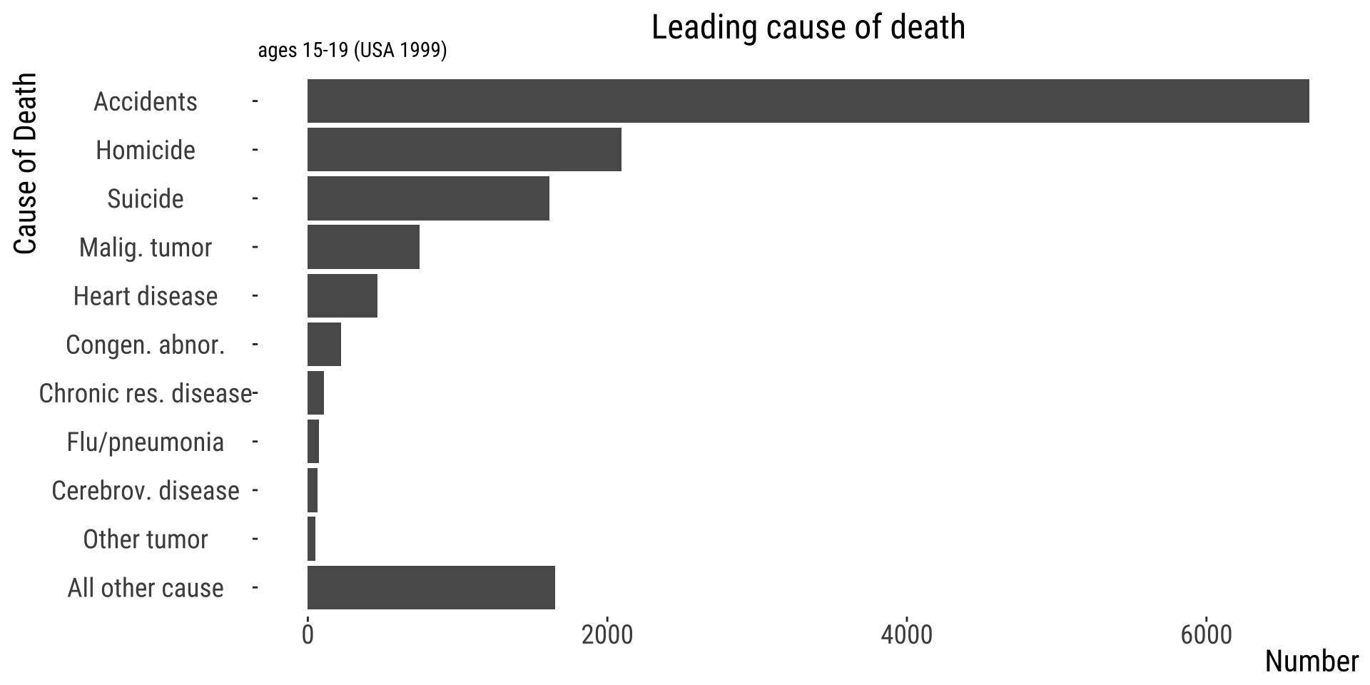
Presenting magnitudes dishonestly
- This plot suggests that centers are 20X taller than guards.
Problem? 👎
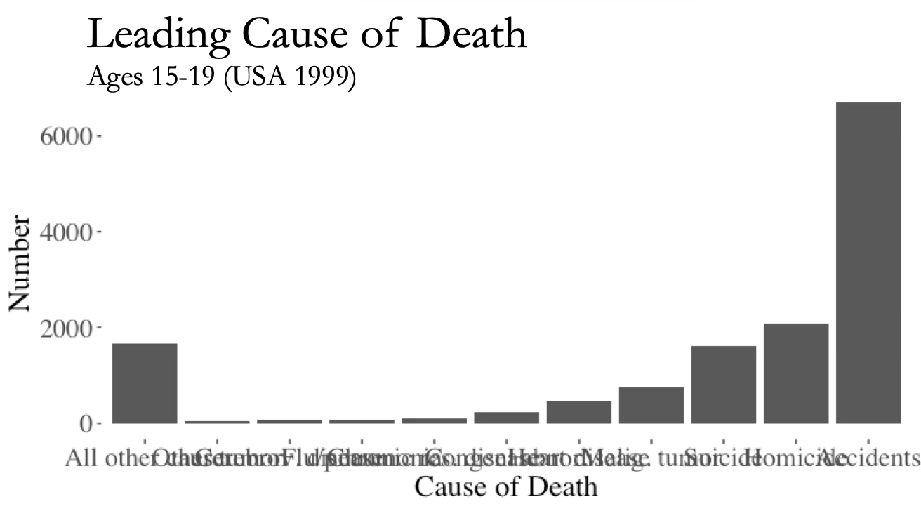
- x-axis labels obscure one another.
👍 Flip Axes to Present Graphics Clearly
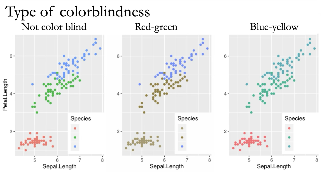
👍 Clear Graphics for Everyone
Consider your audience
Direct Labelling May Clarify Graphics
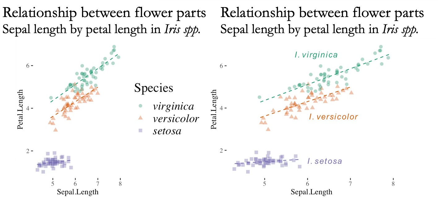
Labels directly on plots may also help with clarifying patterns
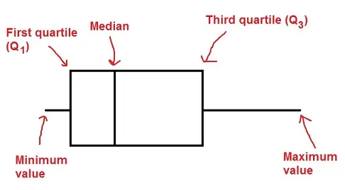
Case 1: If there are no outliers in the dataset
R uses the popular method of \(\text{lower fence}=Q1–1.5(IQR)\) and \(\text{upper fence}=Q3+1.5(IQR)\). If there are no values beyond these limits, it considers the dataset to not have outliers for the purposes of a boxplot:
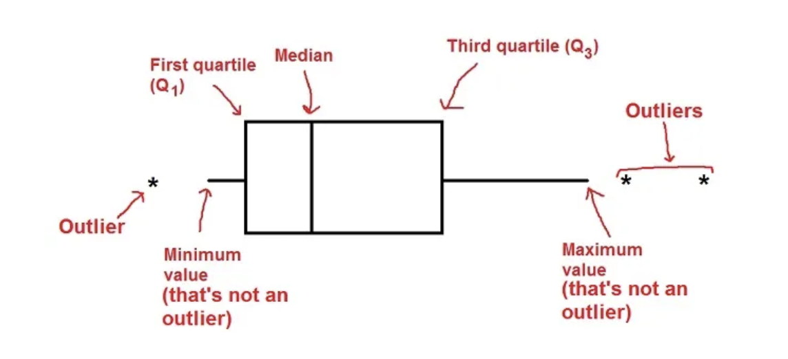
Case 2: there are outliers
If there are outliers, whiskers go up to \(Q3+1.5IQR\) and down to \(Q1-1.5IQR\) and outliers are shown as circles
That’s all for today

From: makeameme.org