4.1.Estimation with Uncertainty
2025-10-22
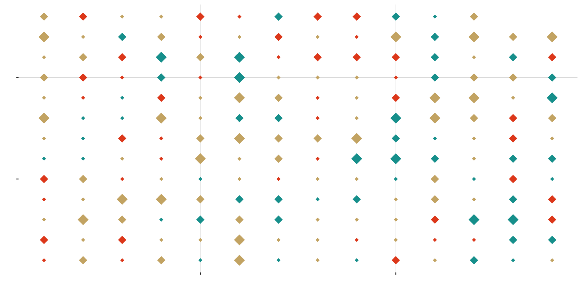
A sample of 20 diamonds
Code
star.sample.size <- 20
stars.sample <- sample_n(stars, size = star.sample.size, replace = FALSE)
ggplot(stars.sample, aes(x = x, y = y, color = color, size = size)) +
  geom_point(shape = 18, show.legend = FALSE) +
  scale_color_manual(values = asteroidcity1()) +
  bb_theme() +
  ylab("") +
  xlab("") +
   theme(axis.text.x = element_blank(), axis.text.y = element_blank())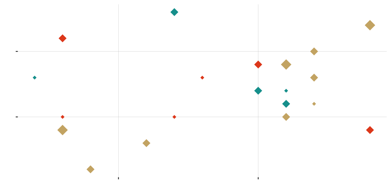
| small | medium | large | |
|---|---|---|---|
| blue | 2 | 3 | 0 |
| gold | 1 | 5 | 3 |
| red | 3 | 3 | 0 |
Another sample of 20 diamonds
Code
star.sample.size <- 20
stars.sample <- sample_n(stars, size = star.sample.size, replace = FALSE)
ggplot(stars.sample, aes(x = x, y = y, color = color, size = size)) +
  geom_point(shape = 18, show.legend = FALSE) +
  scale_color_manual(values = asteroidcity1()) +
  bb_theme() +
  ylab("") + ylab("") +
  theme(axis.text.x = element_blank(), axis.text.y = element_blank())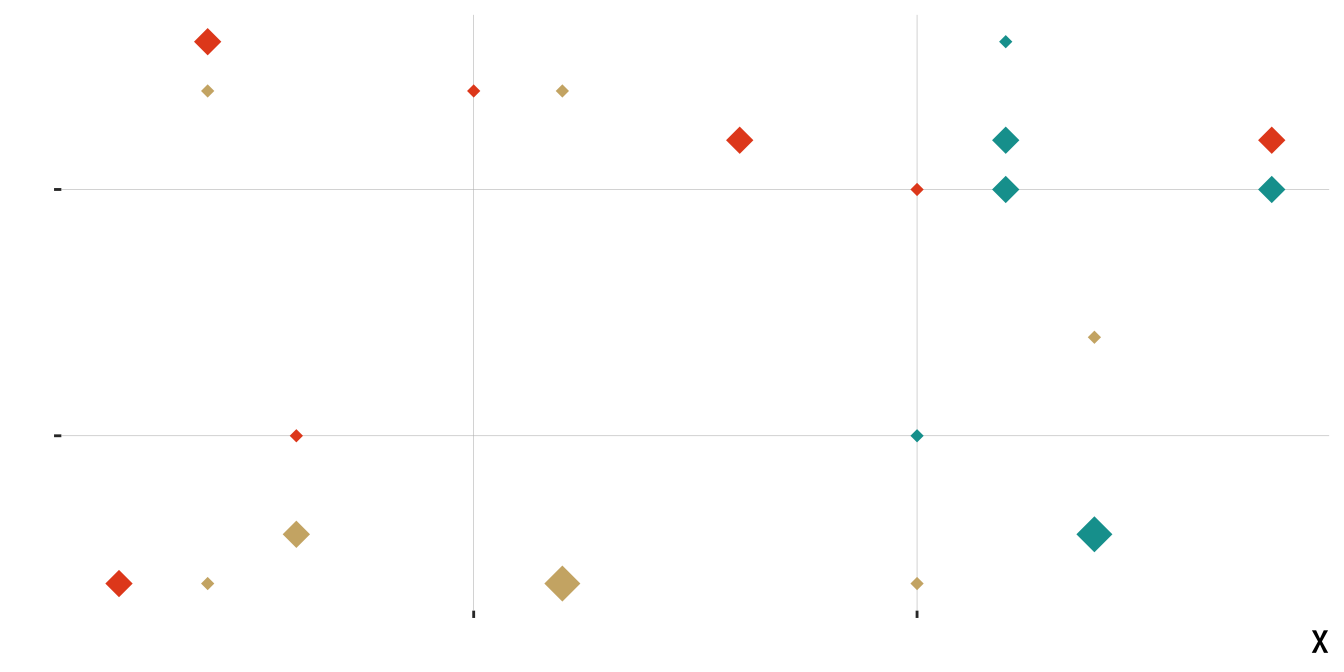
| small | medium | large | |
|---|---|---|---|
| blue | 2 | 3 | 1 |
| gold | 5 | 1 | 1 |
| red | 3 | 4 | 0 |
Aaaand … another
Code
star.sample.size <- 20
stars.sample <- sample_n(stars, size = star.sample.size, replace = FALSE)
ggplot(stars.sample, aes(x = x, y = y, color = color, size = size)) +
  geom_point(shape = 18, show.legend = FALSE) +
  scale_color_manual(values = asteroidcity1()) +
  bb_theme() +
  ylab("") +
  xlab("") +
   theme(axis.text.x = element_blank(), axis.text.y = element_blank())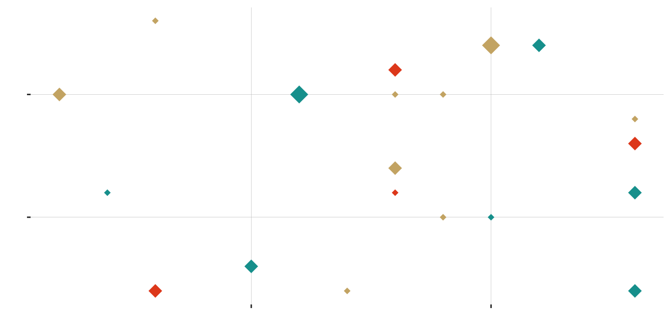
| small | medium | large | |
|---|---|---|---|
| blue | 2 | 4 | 1 |
| gold | 6 | 2 | 1 |
| red | 1 | 3 | 0 |
One Last Sample of 20 Diamonds
Code
star.sample.size <- 20
stars.sample <- sample_n(stars, size = star.sample.size, replace = FALSE)
ggplot(stars.sample, aes(x = x, y = y, color = color, size = size)) + geom_point(shape = 18,
    show.legend = FALSE) + scale_color_manual(values = asteroidcity1()) + bb_theme() +
    ylab("") + xlab("") + theme(axis.text.x = element_blank(), axis.text.y = element_blank())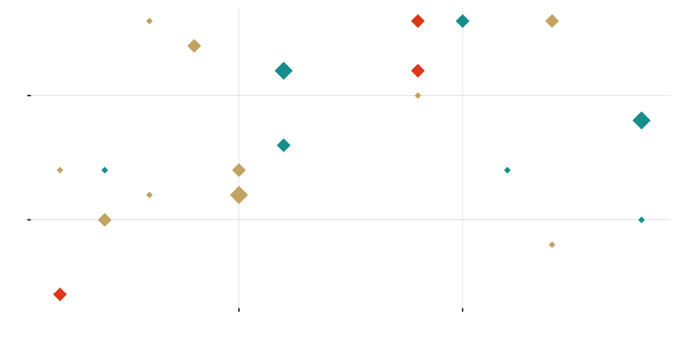
| small | medium | large | |
|---|---|---|---|
| blue | 3 | 2 | 2 |
| gold | 5 | 4 | 1 |
| red | 0 | 3 | 0 |
Sampling distribution of diamond size
Code
ggplot(sampling.dist.large, aes(x = prop)) +
  geom_histogram(binwidth = 1/ star.sample.size, color = "lightgray", fill = "#006475")+
  geom_vline(xintercept = true.prop.large, lty = 2, color = "white") +
  ggtitle(sprintf("Sampling distribution: Proportion large diamonds (n = %s)", star.sample.size),
          subtitle = "Dotted white line is the population parameter") +
  xlab("proportion")+
  ylab("# of replicates\n(of 1000 simulations)")+
  bb_theme()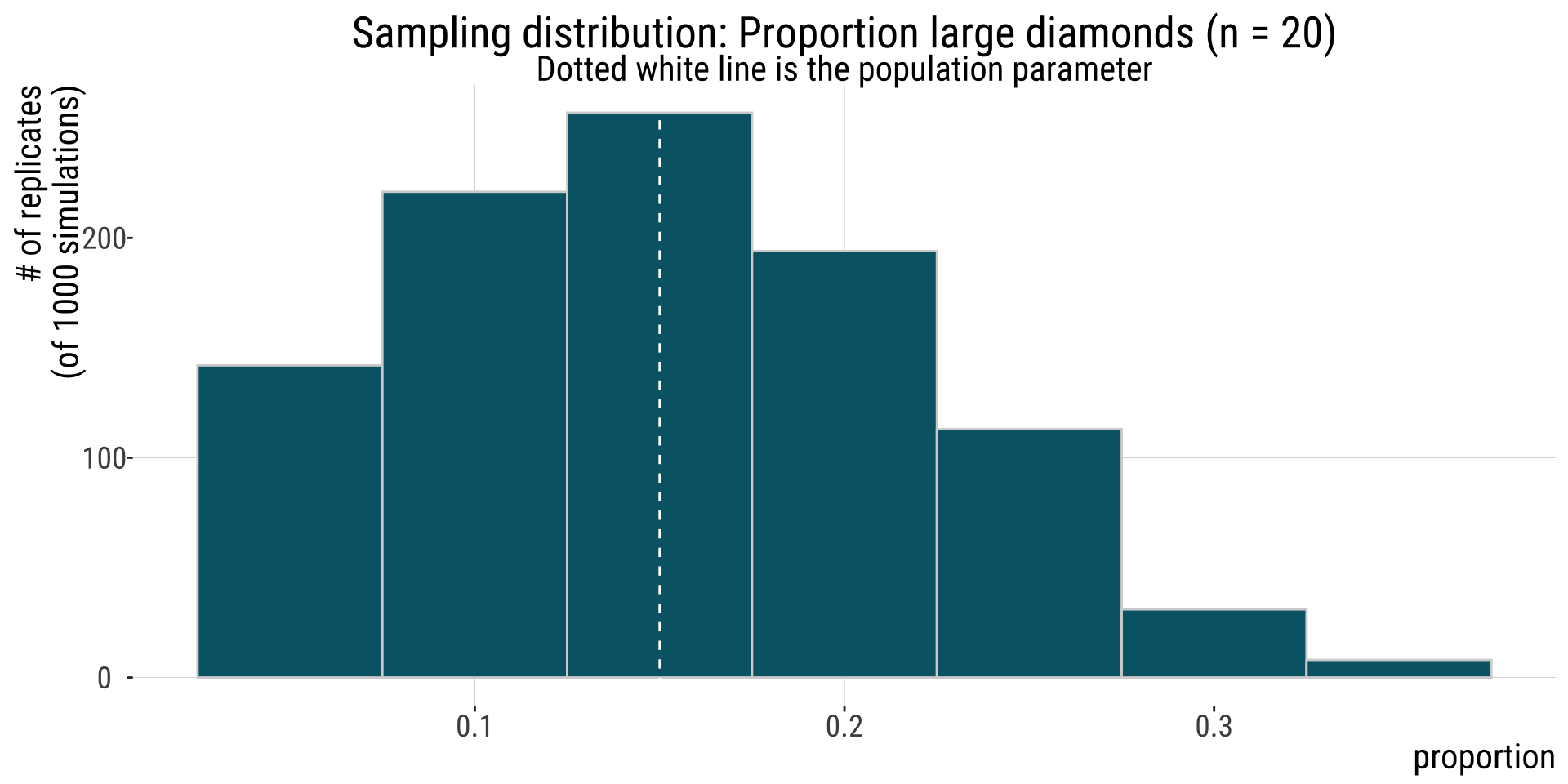
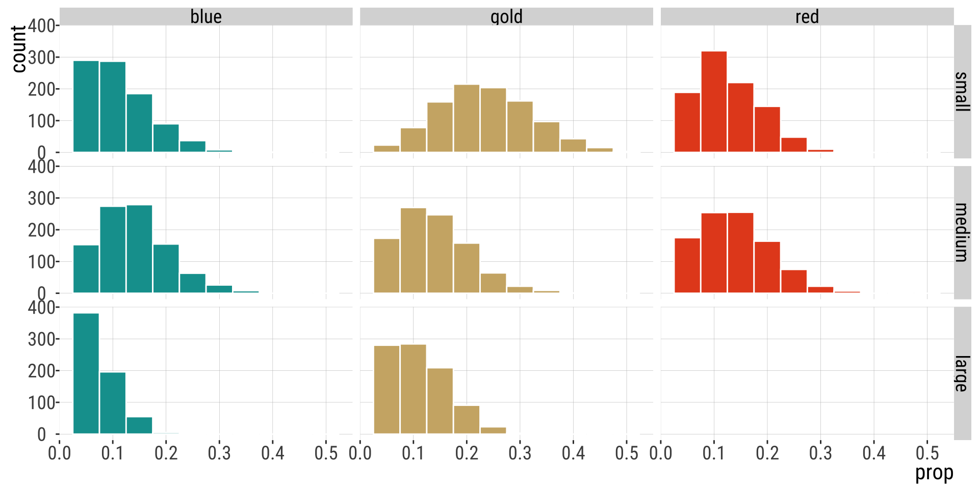
The joint sampling distribution
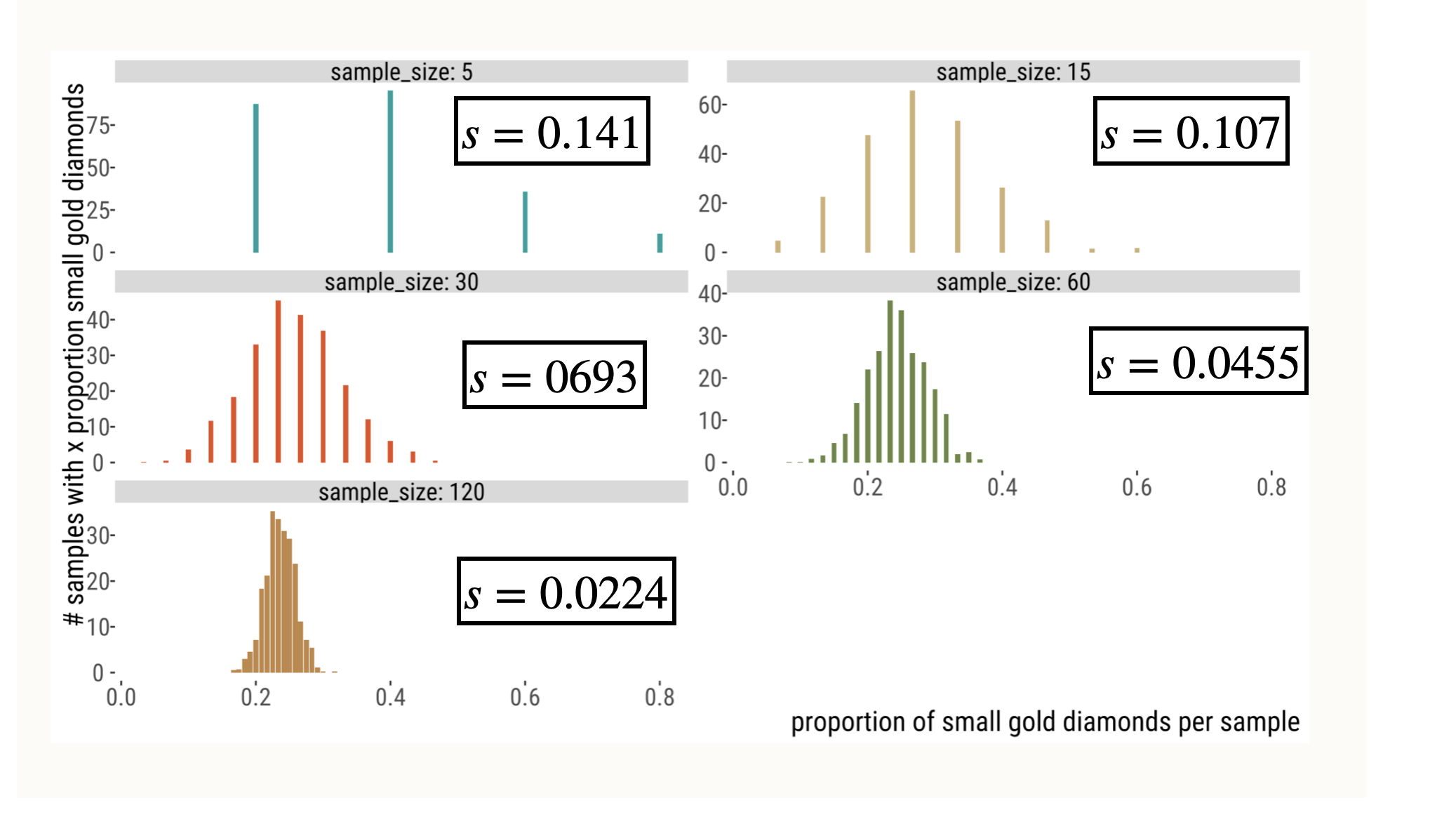
Variability in Estimates Decreases with N
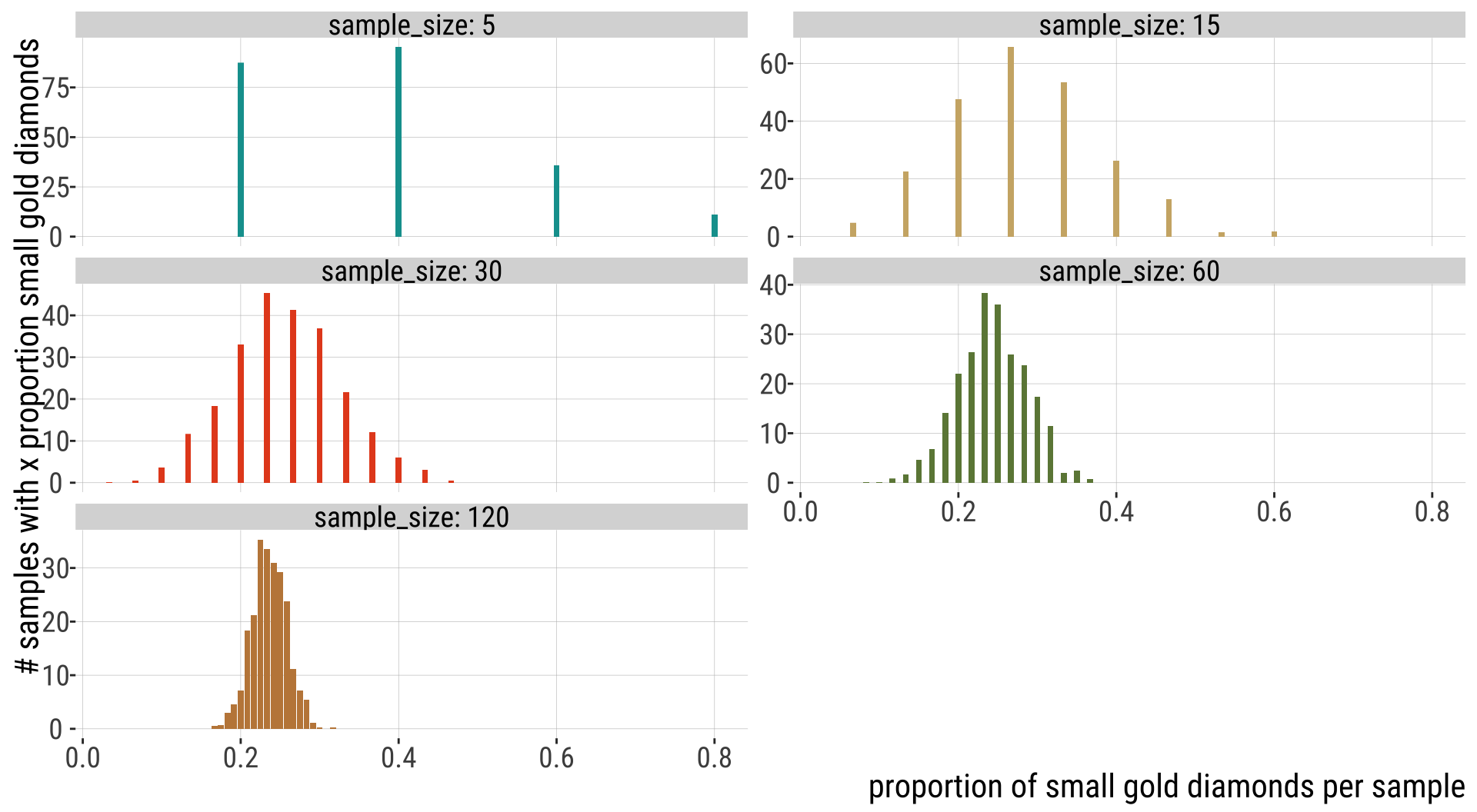
Variability in Estimates Decreases with N
Human gene lengths
Code
ggplot(human_genes , aes(x=size)) + geom_histogram(aes(y=after_stat(count / sum(count))),bins=60, color="lightgray", fill="#006475") + xlab("Gene Length (basepairs)") +
  ylab("Relative Frequency")+
  annotate('text', x = 10000, y = 0.04,
        label = "mu==3511.5",parse = TRUE,size=10) +
  annotate('text', x = 10000, y = 0.03,
        label = "sigma==2833.2",parse = TRUE,size=10)+
  bb_theme()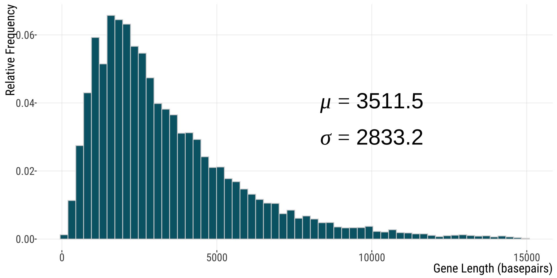
Note: parameters shown are for full dataset (n=20,290) but 26 genes with length > 15,000 were omitted from this plot.
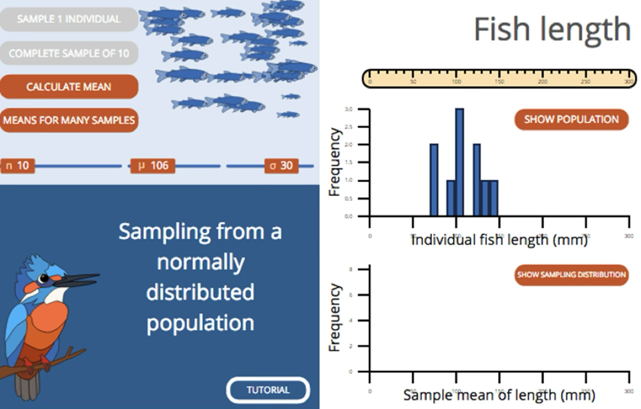
Sampling Distribution: from textbook
That’s all for today

From: makeameme.org